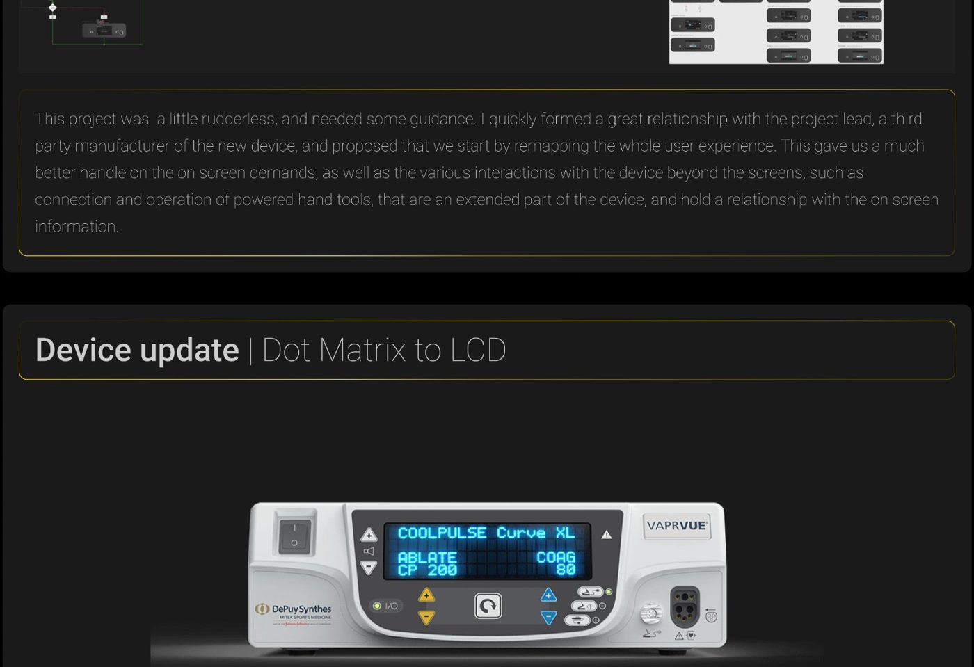
The honest starting point: nobody on the team, including me at first, could answer "if the user taps this, where do they end up?"
Building the map before building the screens
Rather than patch individual screens, I built a full logic map of the end-to-end journey — including interactions that extend beyond the screen itself, like connecting and operating powered hand tools. That map became the team's shared reference for every user story, and let us split the work into clear sprints with real deliverable boundaries.
What surgeons actually need to see first
With the device now fully digital, I could be deliberate about visual hierarchy in a way the old hardware couldn't support. The measured data surgeons actually act on — RPM, mode — sits large and central. Supporting status sits in the periphery, so a glance gives the number that matters first.
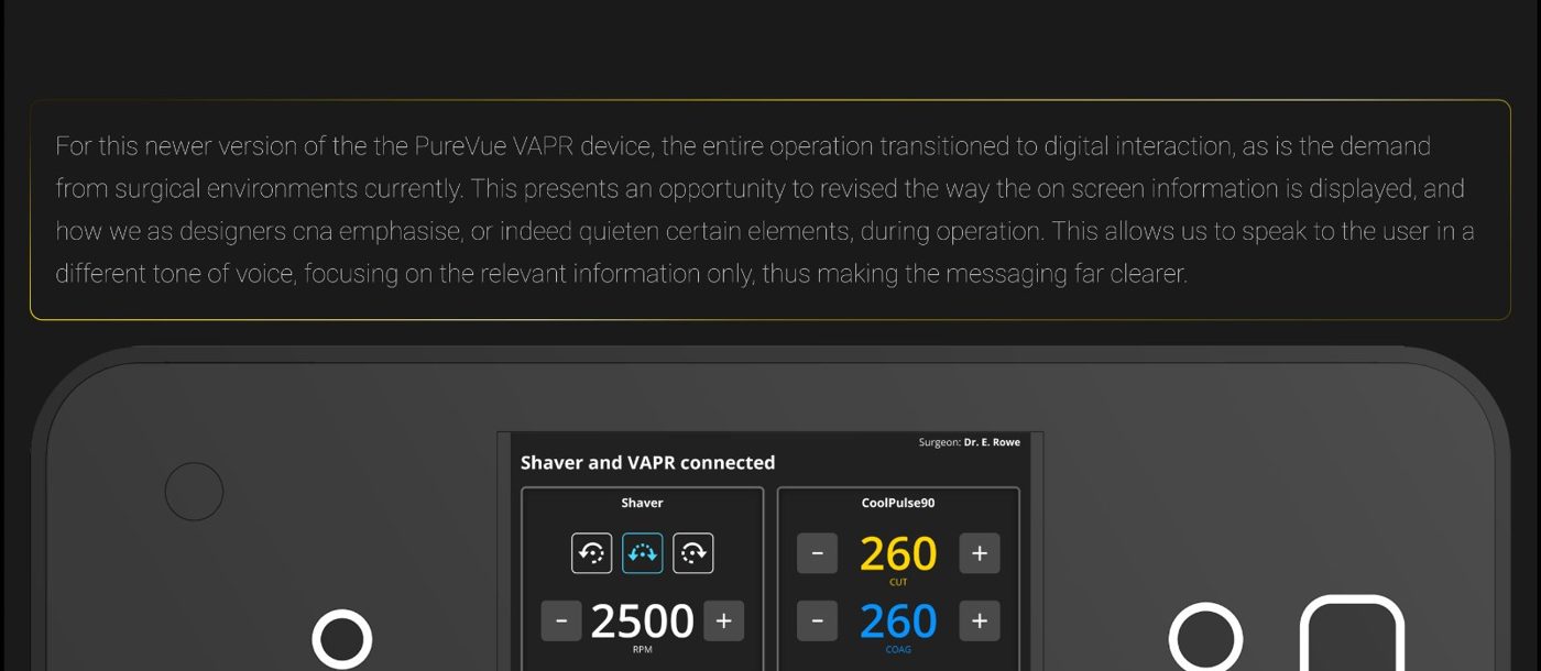
The redesigned touchscreen — measured data large and central, status in the periphery.