Most "design systems" are really just component libraries
Many design systems I encountered in the early years of my UX career were, in fact, component libraries — static groups of buttons, dropdowns, and so on, that a designer would copy and paste into their work, then double-click three or four times to edit labels, icons, colours, sizes. With no governance and no guidance, these libraries can be detrimental to the future consistency, clarity, and usability of a designer's work.
Building this design system, I wanted any designer on the team to be able to access, use, and edit a full suite of components that adhered to our principles of visual design and usability — using the right components for the right hardware and the right brand, and only able to edit the top-level changeable elements (labels, status, hierarchy), not the colour, not the font, not an icon found on the internet.
That inconsistency was a real, recurring problem: designers moving between DePuy Synthes and Ethicon products would land on a different blue, a different icon style — because nothing forced consistency across brands. I built this system to fix that.
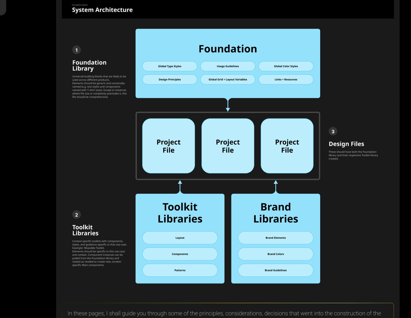
Three tiers: Foundation, Toolkit, Project
A Foundation Library holds universal building blocks likely to be used across every product — global type styles, usage guidelines, global colour styles, design principles, grid and layout variables, and links and resources. Elements here are named generically (T-shirt sizing, not brand-specific labels) so the file stays comprehensive and reusable.
Toolkit Libraries adapt the Foundation to a specific context — a wearable device, for example — with layout, components, and patterns specific to that use case, pulling instances from the Foundation and nesting them into new, context-specific components.
A parallel Brand Library stream (Brand Elements, Brand Colours, Brand Guidelines) runs alongside the Toolkit stream. Both feed into Project Files — which should have both the Foundation library and their respective Toolkit library created before work begins.
Colour — using semantic labelling
The brief for colour: establish a range of shades and tints based on lead brand colours, define clear additional messaging colours for alerts, warnings, and success states, and accommodate alternatives for other brands.
Primitive tokens
The raw, core colour values that serve as building blocks for colour usage in the system — Neutrals (Black through to White), Accents, and Transparencies.
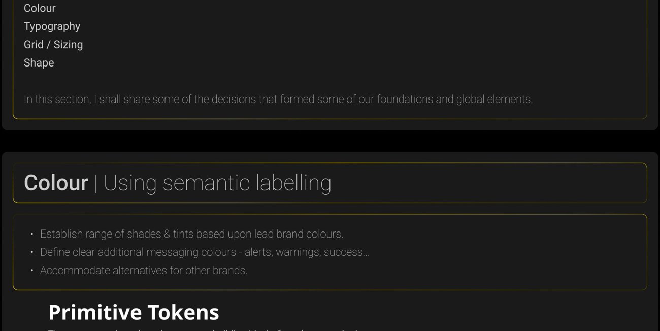
Primitive tokens — the raw values behind every colour decision.
Primitive tokens are never used directly in final designs or components, but they populate the styles used in Figma and provide the code for final dev handover documents. For the DePuy Synthes range, only Blue and Neutral needed defining — though the brand colour doubling as the interaction colour created real risk of misuse and overuse of the accent.
Semantic tokens
Semantic tokens apply meaning to selected colour values: Text (Primary, Secondary, Disabled, Inverse), Interaction (Active, Disabled), and Alert (Error, Warning, Success).
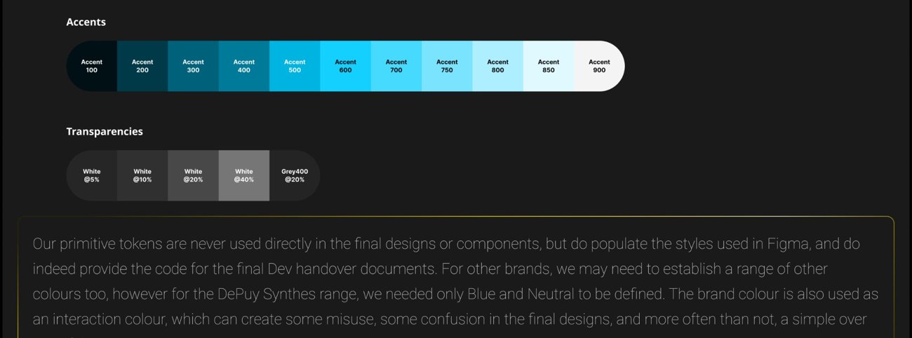
Semantic tokens — telling the designer which colour to use, and why.
These tokens inform the designer which blue to use for a point of interaction, which neutral for a body of text, which yellow for an error modal — cutting out designer error from sampling a colour, or matching by eye, which still happens, and completely baffles me.
Shape — extending design language into the screen
Align with the industrial design: wherever possible, the radii in a design should align with the physical device it's displayed on — even if that means deviating from or extending the system's corner radius variables. Doing this creates consistency across a product's overall shape language and function.
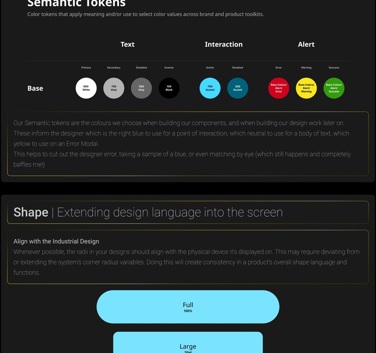
The radius scale — deliberately aligned to physical device geometry.
Concentric forms: shapes within a design should complement each other. When nesting elements, the radii being incorporated need to stay concentric — which sometimes means adjusting new radii to fit existing ones, calculated with a simple formula:
Inner Radius = Outer Radius − (Padding ÷ 2)

Do / don't — concentric radii in practice.
Thinking this far ahead — populating the design system with shape decisions before later designs need them — protects usability by defining padding and radius for given components and groups at the foundation level, so everything built afterward stays visually consistent with the brand guides and meets human factors and usability requirements.
Buttons — the right fit, every time
As a designer using a design system, I want an asset to drop in with a certain amount of decisions already made — I don't want to choose the brand or hardware set every time I drop in a new button. So I kept buttons in separate silos, where branding or hardware constraints determine sub-categories like padding, radius, and colour. It's all too easy to miss one and end up with a slightly different blue — exactly the inconsistency that pushed me to build this system in the first place. You choose your button from the right library, then tailor it to its purpose on screen.
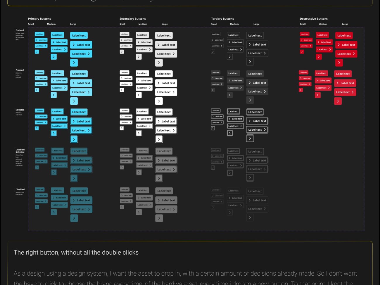
Every button variant — priority, size, and state, atomically controlled.
No more dreaded double-click drilling
Relying on double-click drilling to reach the detail you want to edit invites errors and inconsistencies. By using Figma's component menu sets, and building components the atomic way — based on principles and design tokens — I kept tighter control over their application. Choose the priority and state, and the atomic components respond accordingly and consistently.
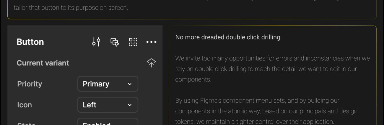
One component, every variant controlled from a single properties panel.
Modals — information & action
Clarity & urgency: using modals to convey a message and call the user to action is a frequent feature across virtually all DePuy Synthes surgical products. Users must be alerted and informed quickly and clearly when something needs adjusting, correcting, or immediate intervention — different levels of risk requiring different levels of urgency, but always in the correct tone of voice, concisely.
Four types — Informational, Success, Warning, Error — cover the range of required contrast and urgency, prompting the user to respond appropriately. Modals without a clear call to action, or that didn't require the user to break from their operation, were removed entirely in favour of notifications instead.
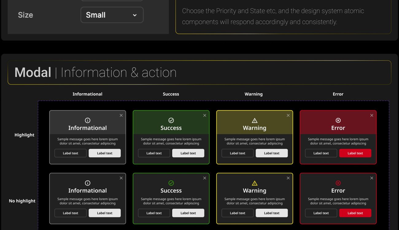
Four modal types, each carrying its own level of urgency.
Placing the text body against the dark background (rather than the previous coloured background) maintains legibility and consistency across all modals — colour denoting urgency clearly and forthrightly, without being overbearing or creating a clash.
What the system had to be
A design system must be underpinned by design principles, have a clear purpose, and imbue those principles into components, templates, patterns, and styles — from the smallest element through every level, to the most complex and nuanced organism.
Universal
Accessible, functional, and adaptable across various form factors.
Consistent
Standardized, uniform, and built on a centralized, shared baseline.
Modular
Scalable and flexible, designed to expand across platforms and systems while working in conjunction with other libraries.
Lightweight
Simple and low-maintenance, reducing time to value on new projects while being predictable and easy for new designers to adopt.
Minimal
Free of unnecessary decoration, offering an honest, straightforward presentation of information.
Performant
Delivers responsive interactions, ensures optimized performance, and prioritizes user actions.
Robust
Adaptable, flexing from focused interactions to high density presentations of information.
Proven
Features battle-tested UI elements and familiar interaction patterns.
Orderly
Predictable, consistent, and easily understood.
Harmonious
Calm visual design, unified concentricity, and a shared form language, ensuring visual harmony across all touchpoints, including UI and hardware.
How it was built
I taught myself design systems from scratch — an 8-week Memorisely course, done online, after office hours, alongside my day job. I later employed a highly reputable agency, PunchCut in California, to help expedite delivery. My role evolved over the course of the project: from initially building every element myself, to eventually overseeing delivery, having built the principles, the majority of base components, and set the definitions and expectations of the system, the style guides, and the component library.
There are many ways to build components — from a one-tool-to-rule-them-all approach, to a range of brand- or hardware-specific libraries. I like fast, iterative loops of build, test, breakdown, learn, build again, during discovery phases. It was only after I'd learned those lessons and defined a clear build path that I handed the reins of the component build to PunchCut, while managing the deliverables thereafter.
This is the best piece of work I did at J&J MedTech, and I am very proud to share that story here.