The problem
SleepHub's prototype UI was built on generic Android components before any brand or UX work had happened — bright, high-contrast red and orange screens, on a device meant to help people fall asleep. Red is a waking colour: it signals urgency, fire, blood. The interface was actively working against the product's purpose.
High-contrast red/orange palette. Generic Android components. No tested user journey. Menus and settings front-loaded before bedtime.
Calm, dark blues. Enlarged touch targets. One obvious "Go" button into Deep Sleep. Consistent navigation building routine over time.
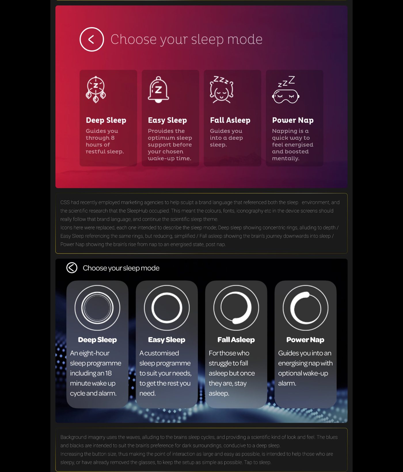
The sleep-mode selection screen — red prototype (top) redesigned in calm blue (below).
The stakes
As Head of R&D, I hadn't been asked to fix this — but I recognised that if I missed the start of production, SleepHub would ship with this UI intact, and early units were going straight to national press for review. I made the call to overhaul the full menu set, information architecture, and UI ahead of T1 production.
The approach
With no formal user testing done on the device, I lived with the prototype myself to understand it as a user would, last thing at night. The clearest insight: someone reaching for this at bedtime doesn't want menus, decisions, or friction — they want to tap once and trust the device to do the rest. So the redesign started from a single, obvious "Go" button into the default Deep Sleep mode, not a settings screen.
From there: replaced the red/orange palette with calm, dark blues; enlarged touch targets for users without their glasses on; kept navigation consistent — a clear Back button, same position, every screen — so the interface builds a routine rather than demanding attention; and redesigned the sleep-mode icons so the visual language means something: concentric rings that tighten toward deep sleep and open toward waking.
Philosophy
"I think of this service like a meal prepared by a Michelin-starred chef: the user shouldn't need to touch the ingredients or the method — there's expertise behind that. What they can do is choose what suits their taste. Information architecture is the service, guiding them through, staying mostly invisible."